What is The Layout of An Ebook?
What is the layout of an eBook?
Its visual and structural arrangement of the text content, headings, hyperlinks, and interactive elements in the eBook.
In other words, the layout establishes the structure of an eBook, making the content easy to read, access, and comprehend.
The success of an eBook doesn’t solely depend on its content; the layout plays a crucial role in enhancing the reading experience.
Therefore, an ideal eBook layout must strike a balance between aesthetics, functionality, and user engagement.
In this blog post, we shall delve into best practices for eBook layout, how to create it, and why it matters.
Share This Blog Post On:
This post might contain affiliate links. I may earn some commission if you click on such links. You shall not incur any extra cost if that happens. Please read our full affiliate disclosure here!
DO NOT FORGET TO….
|
WHY DOES EBOOK LAYOUT MATTER?
The layout of an eBook is vital for:
Improvement of Readability
The font size, line spacing, and margin choices are influenced by the decisions related to the layout. No matter the device being used, a well-designed layout guarantees that the content is easy to read.
Visual Appeal
The eBook’s overall visual appeal is improved, and reader engagement is increased by an aesthetically acceptable layout with eye-catching design features like graphics, chapter headings, and cover images.
Navigation Ease
Readers can locate and browse through the eBook’s various sections with ease because of a well-organized layout, a clear table of contents, and user-friendly navigation tools, which improve the user experience.
Professionalism and Credibility
Readers are more likely to remain engaged with the author’s or publisher’s content when it is presented in a polished and well-designed layout that exudes professionalism and credibility.
Accessibility Improvement
The eBook is made accessible to users with disabilities or visual impairments by paying attention to layout design concerns, including text contrast, color schemes, and font accessibility. Additionally, eBooks should be screen-size and device-optimized so readers can access and enjoy the information on multiple platforms with ease.
Brand Representation
An eBook’s layout can mirror the author or publisher’s visual theme or brand identity. Ultimately, this can help to create a consistent brand presence across digital platforms.
WHAT ARE THE BEST PRACTICES FOR EBOOK LAYOUT?
You can facilitate navigation and comprehension in the layout structure through the use of:
Headings
Clear headings and subheadings act as signposts, guiding readers from one section to the next with ease. This kind of layout breaks the text into manageable chunks to prevent information overload and enhance comprehension.
Whitespace
Whitespace provides breathing room for the eyes, preventing fatigue. It also helps to create a sense of balance and harmony, allowing the content to shine without feeling cluttered or overwhelming.
Table of Contents
A well-organized table of contents must have descriptive chapter titles and clickable functionality. Since it helps your readers to navigate your eBook with ease, invest time and effort into crafting it to make sure that they engage with your content more effectively.
Cohesion
Consistent placement of navigation elements, such as page numbers or clickable links, ensures that readers can easily track their progress and revisit previous sections if needed.
Adaptability
A responsive layout adjusts dynamically to accommodate various screen sizes and orientations, ensuring a consistent reading experience across devices.
Constant Updates and Improvements
Commit to keep refining the eBook layout in response to user input, emerging technologies, and shifting design fads. To guarantee the layout’s continued applicability and efficacy, evaluate and improve it frequently.
Integration of Interactive components
To improve reader engagement and interaction, include interactive components like multimedia content, hyperlinks, and interactive quizzes.
Typography
Be mindful of typographic aspects, including line spacing, kerning, font choice, and size. Select digitally readable typefaces and tweak typographic settings for best legibility.
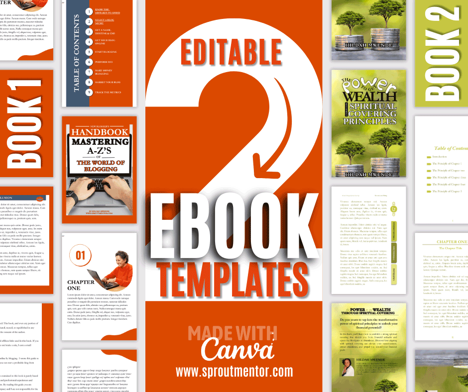
HOW CAN YOU CREATE AN EFFECTIVE EBOOK LAYOUT?
Establish Your Objectives
Clearly state the aims and purposes of your eBook, along with the desired readership and results.
Select the Appropriate Software
Choose the right program or tools for creating eBooks according to your needs and level of experience with the platform. For instance, you can use Microsoft Word, Adobe InDesign, and specialized eBook authoring programs like Calibre or Scrivener.
Study Your Audience
To ensure that the eBook layout is appropriate, conduct research to learn about the preferences, interests, and reading patterns of your target audience.
Plan the Structure
Write a thorough content outline that lists the primary ideas, subjects, and points that should be addressed in each eBook section. Create wireframes or mockups to envision the layout and design aspects. This enables you to test out various layouts and gather input.
Establish a Visual Hierarchy
Using formatting, color, and size to highlight headings, vital information, and key points within the eBook creates a clear visual hierarchy.
Iterate and Refine
To enhance usability, readability, and the user experience overall, get advice from beta readers or reviewers and make necessary adjustments to the layout design.
In conclusion, an eBook’s layout has a crucial role in both the reading experience and the publication’s overall success. An efficient eBook layout improves the publication’s visual appeal, ease of navigation, and overall professionalism, in addition to making the material easier to read, access, and understand. Authors may optimize the potential of their eBooks to educate, amuse, and motivate readers across the globe by carefully considering both design and user experience.
DO NOT FORGET TO….
|

